


We’ve made many enhancements to Reveal 11 since my last post on this topic, with releases delivered on April 19, May 24, June 21, and most recently August 2.
In today’s post I’ll look at three recent enhancements, all aimed at expanding how you can work with dates. They are the ability to change intervals in the Timeline, a new way to search date fields, and an additional way to present information in the Heatmap.
Each of these enhancements lets you get at potentially critical information quickly and easily, improving your ability to search and sift through client data to glean important insights.
Choosing Timeline Intervals
One of the newest enhancements lets you choose from six fixed Timeline time intervals – year, quarter, month, week, day, or hour – instead of always using only the default Auto setting.
When you look at the Timeline in the Dashboard, you see a chart displaying a series of columns that depict the content in your dataset or the results of a search:
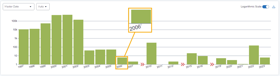
Each column represents a unit of time. In the example above, each column represents a year.
By default, the Timeline is set to Auto. When it is on Auto, the platform evaluates the set of data you are displaying and sets Timeline intervals it determines will visualize the data well. It will choose between Year, Quarter, Month, Week, Day, and Hour. In the example above, the platform opted for Year.
What’s New
With the August enhancements, we introduced the ability for you to change the interval of time used for the columns. You could leave the setting to Auto, but you also could choose Year, Quarter, Month, Week, Day, or Hour.
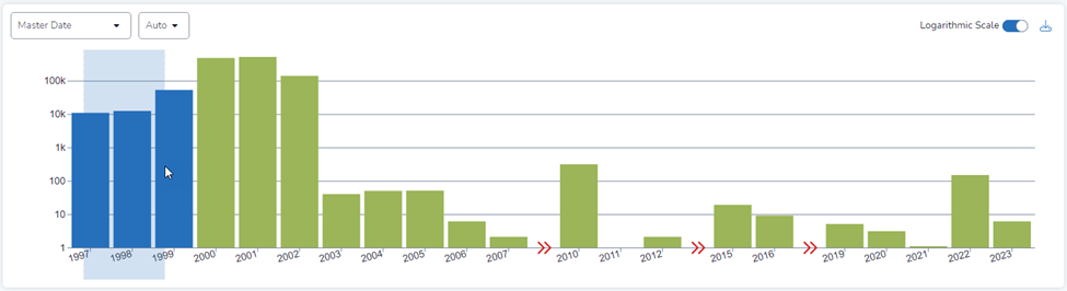
To demonstrate, I narrowed my search by mousing over a three-year period:
Then, I selected Quarter from the pulldown menu:
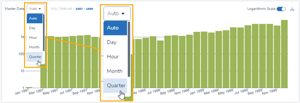
The platform updated the display of my search results, showing columns by quarter instead of by year:
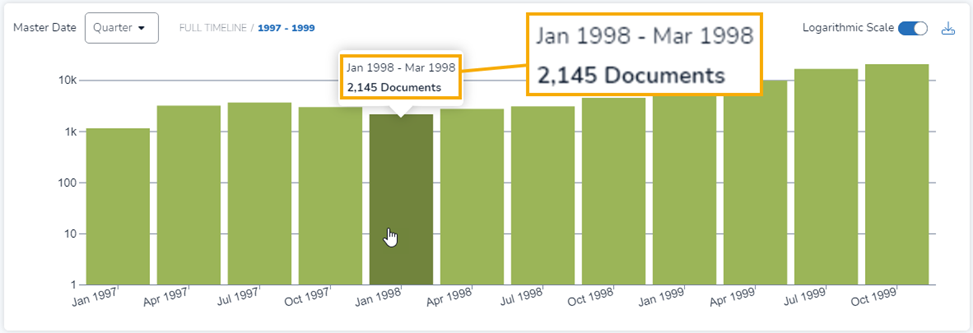
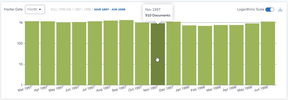
The Month view for is similar:
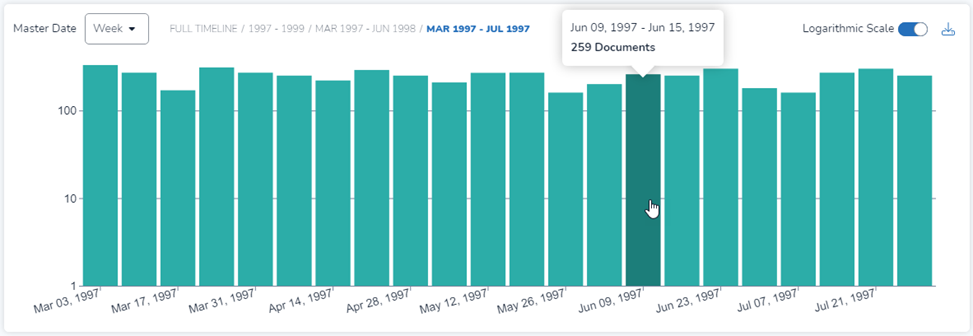
The Week view also is similar:
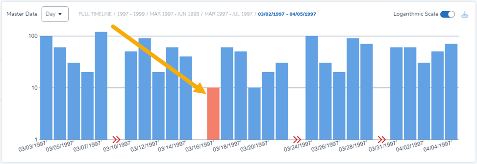
The Day view has an added feature, showing weekend days in a different color (March 16, 1997 was a Sunday):
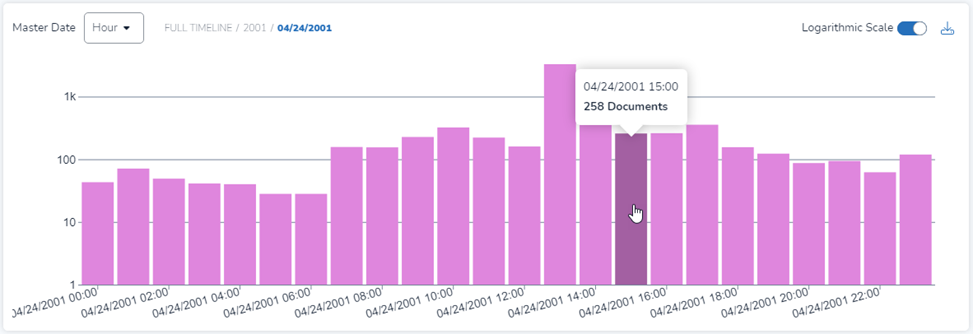
Finally, here is the Hour view:
Finding Yesterday
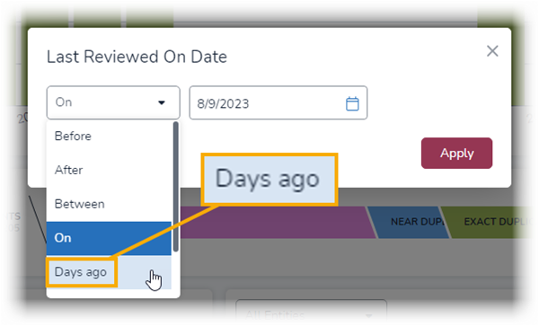
Reveal has long let you search for data from, before, after, or between dates. Now, with a new operator called Days ago you can perform searches that bring back content from 1, 2, or more days before the date of your search.
Explanation by example might work best.
From the Search Bar
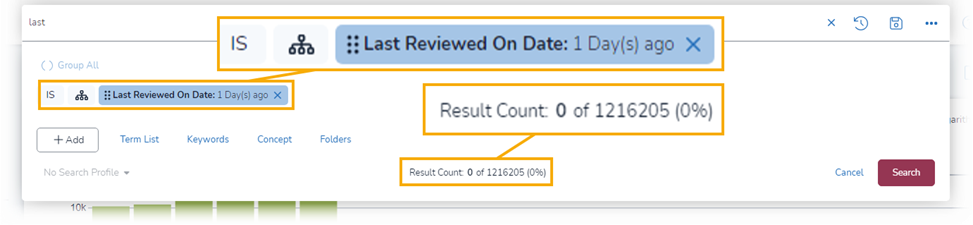
In the search bar, I typed last. This brought up a slew of fields with “last” in the name including Last Reviewed on Date, which I selected:
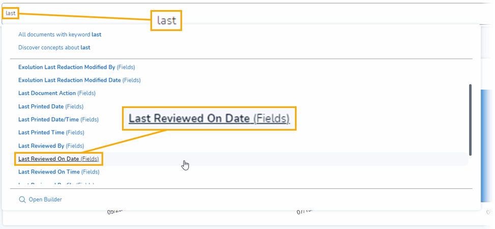
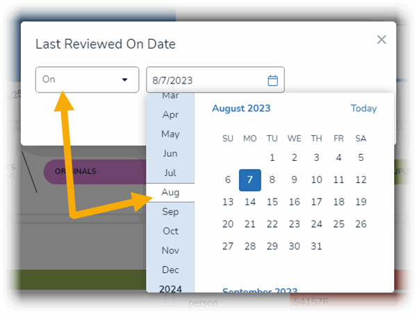
Selecting Last Reviewed on Date opened a modal that presented me with two options, choose an operator and second to choose a date:
The Days ago operator is what I wanted:
From there, I could designate the number of days ago I wanted to use:
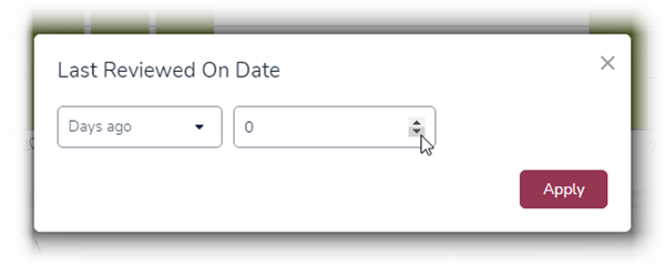
With Days ago, 0 equals today, 1 equals yesterday, 2 equals that day before yesterday, and so on.
When I chose 1, I got back zero documents:
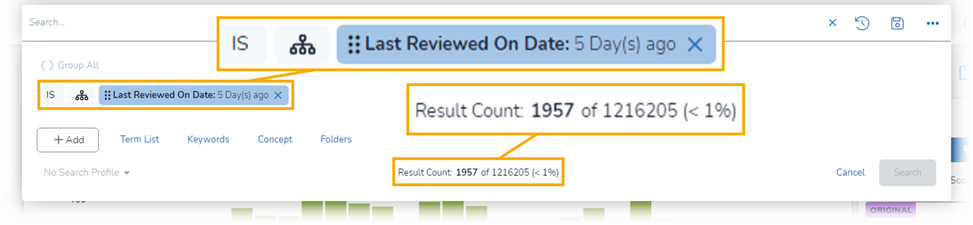
When I opted for 5 days ago, however, I got back 1,957 documents – all reviewed in the five days before I performed my search:
From the Grid
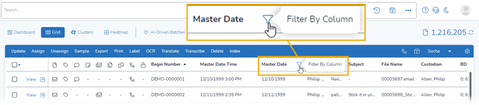
The Days ago search also can be done from the Grid, with any date field.
Here, I went to the Grid view, then moved the mouse over the heading for the Master Date field. That brought up the icon I could use to filter by that field:
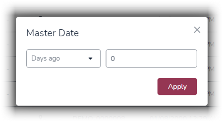
Clicking on that icon brought up a modal for the Master Date field, which once again let me choose an operator and a date:
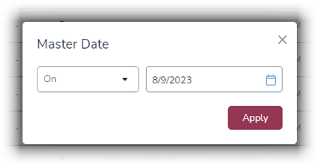
From there, I selected Days ago for the operator, which changed the modal to let me choose the number of Days ago that I wanted to use:
Using Dates in the Heatmap
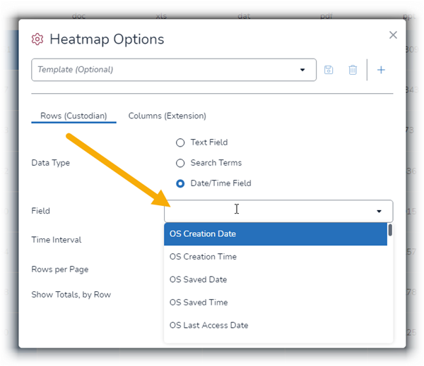
In the Heatmap view, you can now select Date/Time Field as the data type to include as the row in your heatmap. You also can choose the time interval you would like the data to appear in, although auto generally works best.
To do this, first select to Heatmap, then Custodian + Extension, then Date/Time Field to the right of Data Type:

Next, click in the Field box to choose which of the available date/time fields you would like to use:
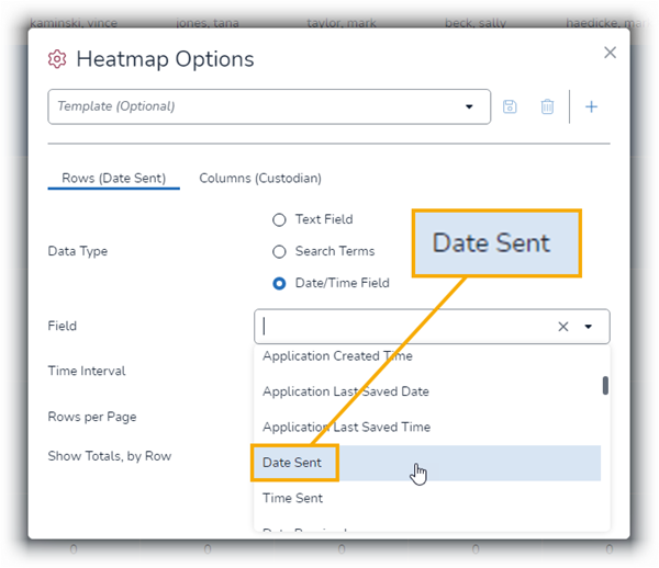
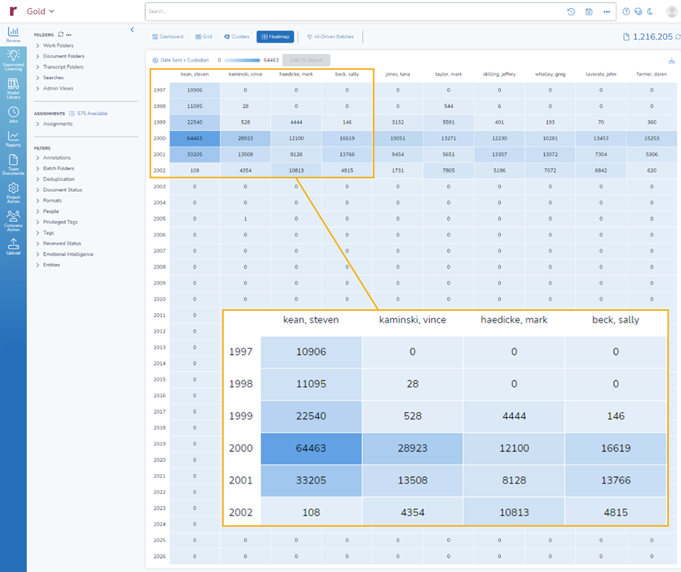
Here, I scrolled to the Date Sent date/time field and selected it:
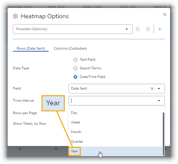
I opted for a Time Interval of Year:
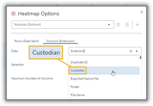
Next, I changed to Columns option to Custodian: and chose Submit:
I also opted to show 30 rows of information.
Here is the heatmap I got back. With the color-coded cells, I can quickly focus in on who sent more messages on a yearly basis (and I could the same for other values and other time intervals):
Learn More
Today, I discussed three of the many recent enhancements we have made to Reveal 11. If your organization is interested in learning more about how Reveal uses data visualization and so much more as an integral part of its AI-powered end-to-end legal document review platform, contact us.