

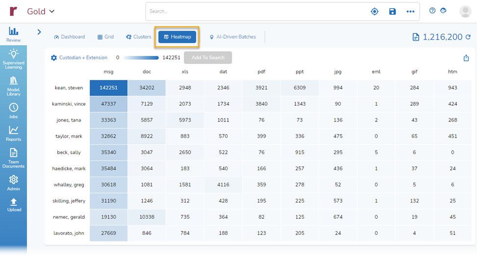
In January we added a new view to Reveal 11, the Heatmap. The Heatmap gives you an additional way to quickly see meaningful patterns in your data. With it, you can select two sets of information and see how they line up against each other. By default, you are shown counts of document types by custodian.
With a few clicks, you can select different criteria and use the results in myriad ways. Using the Heatmap, you could evaluate the likely efficacy of proposed search terms, get an overview of privilege calls made by reviewers, of develop a deeper understanding of the different languages used in your documents – all examples discussed below.
The Heatmap adds yet another data visualization tool to our set of offerings, helping further accelerate your speed to insight.
What is a Heatmap?
A heatmap, according to everyone’s favorite resource Wikipedia, is a data visualization technique that shows magnitude of a phenomenon as color in two dimensions. The variation in color may be by hue or intensity, giving obvious visual cues to the reader about how the phenomenon is clustered or varies over space.
There are various types of heatmaps: grid, spatial, clustered, correlogram, and so on. The type of heatmap we use is a grid.
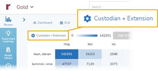
A grid heat map starts with two variables, one mapped on the vertical axis of the map and the other on the horizonal axis. In this example, Custodians are mapped on the vertical axis, Extensions on the horizontal:
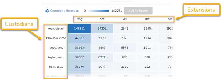
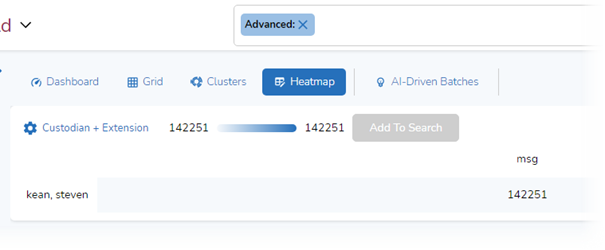
The boxes in the grid show the values for the combined variables. Here, for example, we see that in our dataset for the custodian Steven Kean there are 142,251 msg files (email messages) and 34,202 doc files (Word documents):
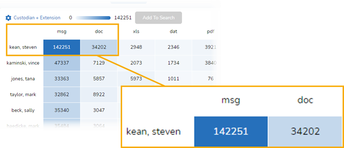
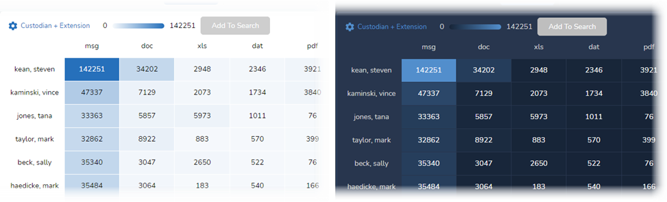
Color intensity is used to indicate the “heat” of each cell: the preponderance of intersections within the grid. The larger the number in the cell, the brighter the color of the cell. Here are examples, one from our Light Mode and the other from our Dark Mode:
Why Should I Care?
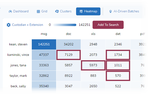
With color intensity, at a glance you can see patterns in your data. Patterns matter because they help you shape the story you can tell, help you find weaknesses in the arguments you want to present or those of your opponents, and help you find gaps or new insights.
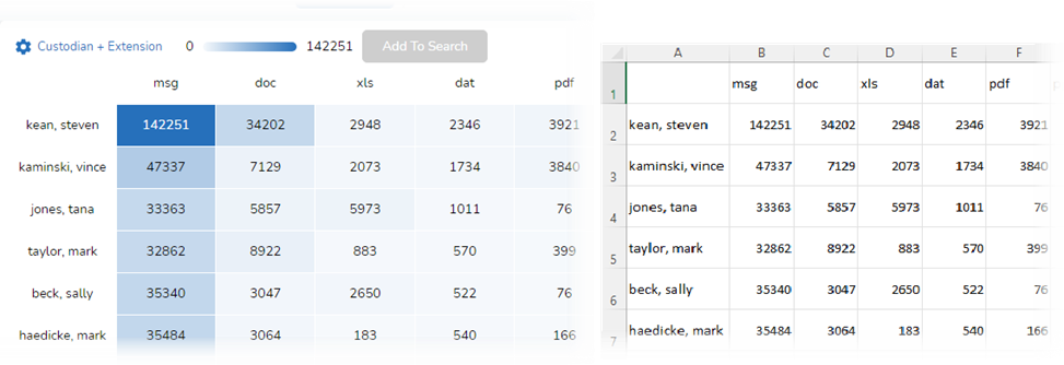
Below is the same data shown in the Heatmap and in Excel. You can see the difference that using colors and color intensity makes. With the Heatmap, it is much easier for your eye to jump to the cells with higher – or smaller – numbers. Without the Heatmap’s color, you may need to spend more time reading the numbers before you can begin to discern patterns:
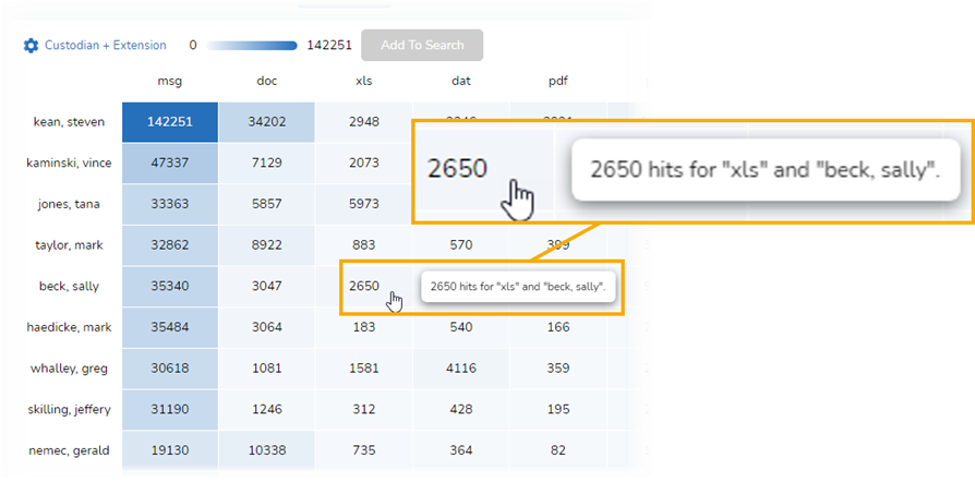
With the Heatmap, you also can hold the cursor over a cell for more information. This way, you don’t have to try to figure out whether the number you are looking at is for, say, Sally Beck as opposed to Jeffrey Skilling, or for xls files rather than pdf files:
How Do I Use the Heatmap?
There are various ways you can use the Heatmap. You can select one or more cells and have the platform formulate a search for you. You can export the Heatmap as a CSV file and work with its contents that way. You can changes the variables used for the Heatmap, selecting from
Add One Cell to Search
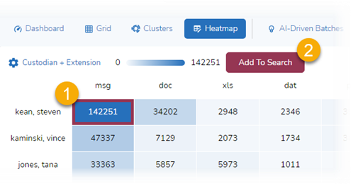
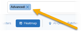
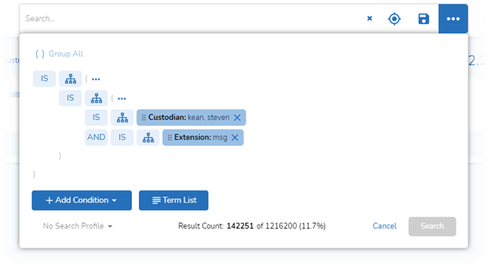
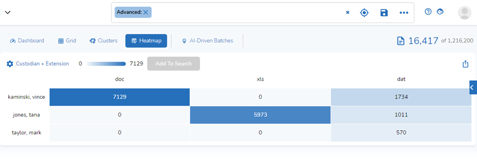
If you click a cell in the Heatmap, you then can select Add to Search to add the that cell to your search:
When you do that, the Heatmap automatically updates to show the results of the new search:
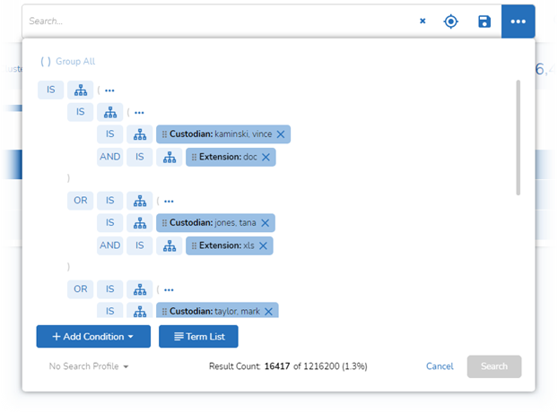
If you click on the pill in the search bar, you can see your search in Advanced Search, which instructs the platform to find all documents where the Custodian is kean, steven and the Extension is msg:
Add Multiple Cells to Search
You can add multiple cells to your search by clicking on each cell you would like to add and then selecting Add to Search:
Here is the updated Heatmap:
And here is the search (you would need to scroll down to see the entire search):
Export the Heatmap
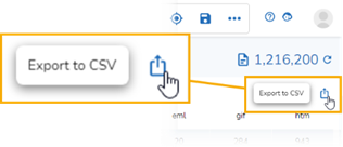
At any point, you can export the Heatmap as a CSV (comma-separated values) file. This will allow you to work with the data in ways the platform might now allow. To export the Heatmap, click on the download button in the upper right corner of the Heatmap:
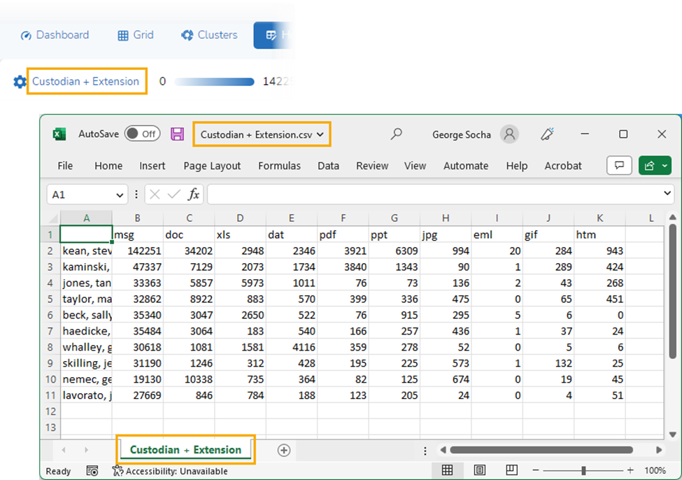
The file will be exported to the Downloads folder on your computer. The name of the file, and the name of the folder in the file, will match the variable used for the Heatmap. The file will contain the same rows and columns of information as the Heatmap:
Choose Different Variables
By default, the Heatmap selects Custodian for rows and Extension for columns. You can change those variables. You can choose from a wide array of metadata fields, create a custom selection of variables, or use a set of search terms.
To change variables, click on the gear icon or the text to the right of it:
This brings up a Heatmap Options window with two parts, Rows and Columns:
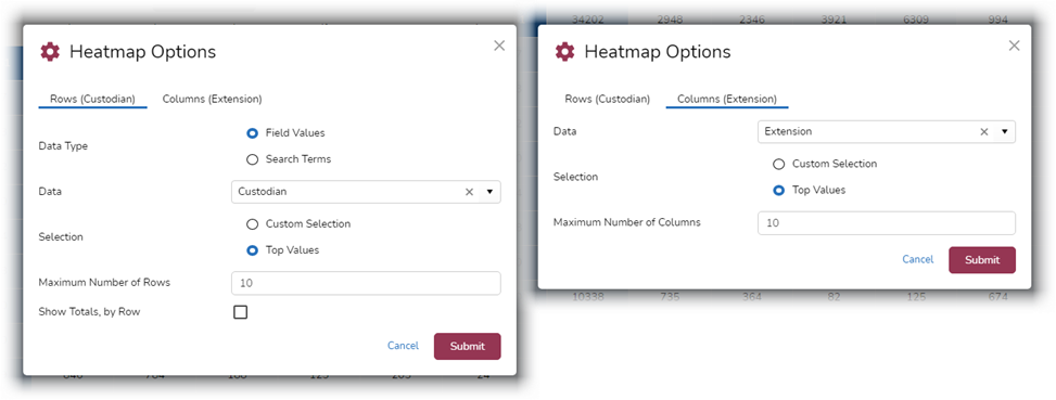
With Heatmap Options, you can change the maximum number of rows or columns displayed (the default is 10), opt to show totals at the end of each row, or change the sources of data for the rows and columns.
There are three ways to change the data used for the Heatmap.
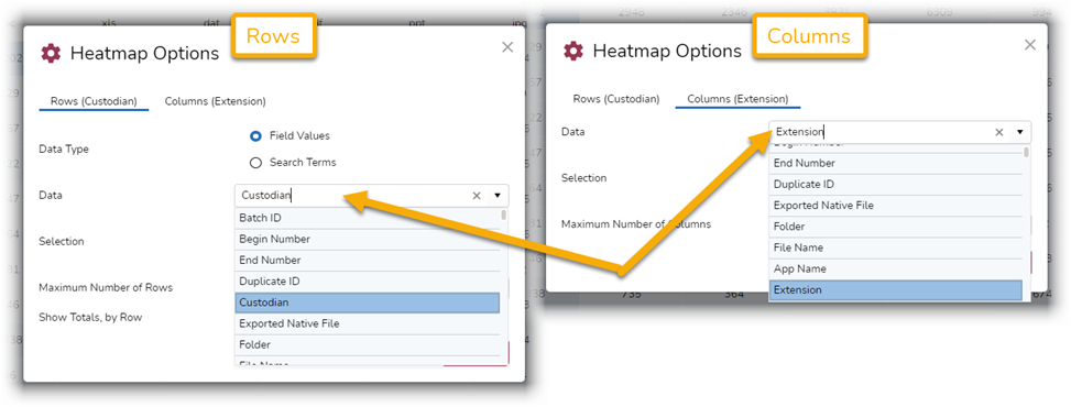
Fields
For both Rows and Columns, you can change the fields from which values are drawn, selecting from any available metadata fields:
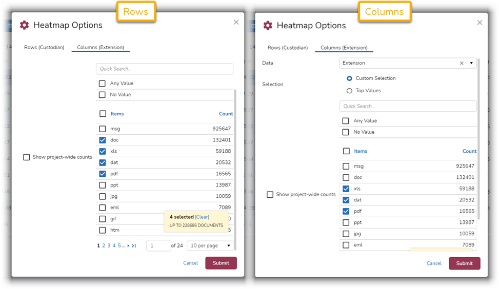
Custom Values
For Columns and Rows, you can select custom values instead of displaying top values:
Search Terms
For Rows, you can use search terms:
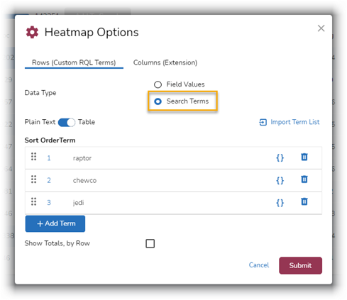
For more about using the Search Terms capability, see Search in Reveal 11: Term List Search.
How What Can I Do with the Heatmap?
Here are just a few examples of the types of things you can accomplish using Heatmap.
Evaluate Search Terms
The Heatmap can be used to help evaluate the efficacy of search terms. You can look at the intersection of search terms and file types, search terms and custodians, and so on.
To start, click on the current row-column selection and select the Search Terms option:
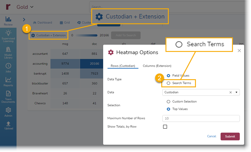
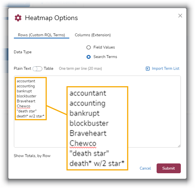
Type in, paste in, or import search terms. You can work with the terms in the Table, or just click Submit:
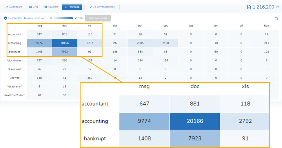
When I do this, I get a Heatmap that provides a clear visual depiction of how often those terms appear within different document types:
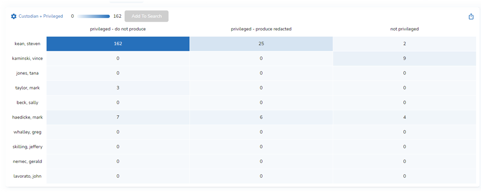
Get a Privilege Overview
This database has been set up to allow reviewers to tag documents as privileged – do not produce, privileged – produce redacted, and not privileged.
To get a quick visual overview of those privilege decisions by custodian, use Custodian in Rows and Privileged in Columns:
Evaluate Use of Languages
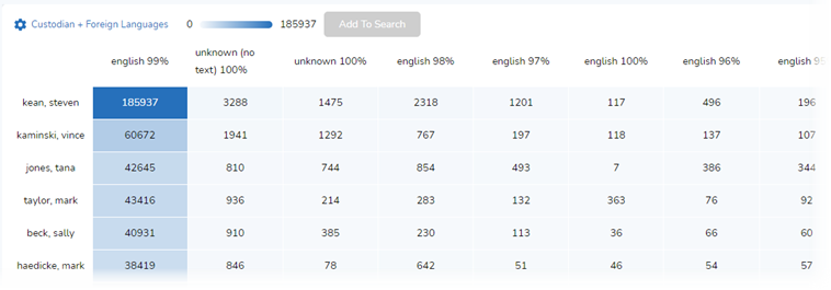
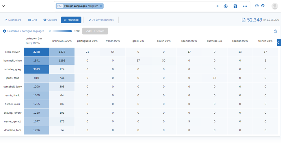
More than ever, we need to be prepared to deal with documents written in various languages. You can use the Heatmap, combined with a metadata search, to get an overview of who has the most documents in languages other than English, for example.
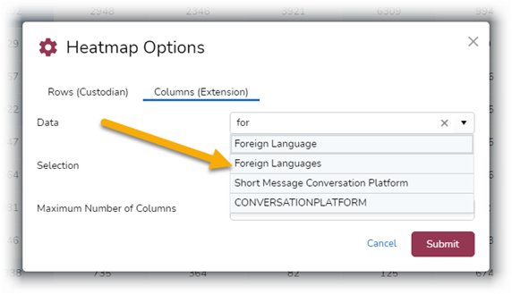
As a first step, change the column selection to Foreign Languages:
When I do this, the Heatmap is populated entirely with English-language documents – not what I want:
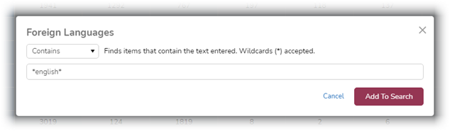
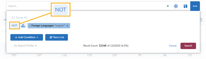
Next, search for all documents containing English:
Modify the search to exclude English documents:
When I do this, I get back a Heatmap showing non-English-content documents by Custodian:
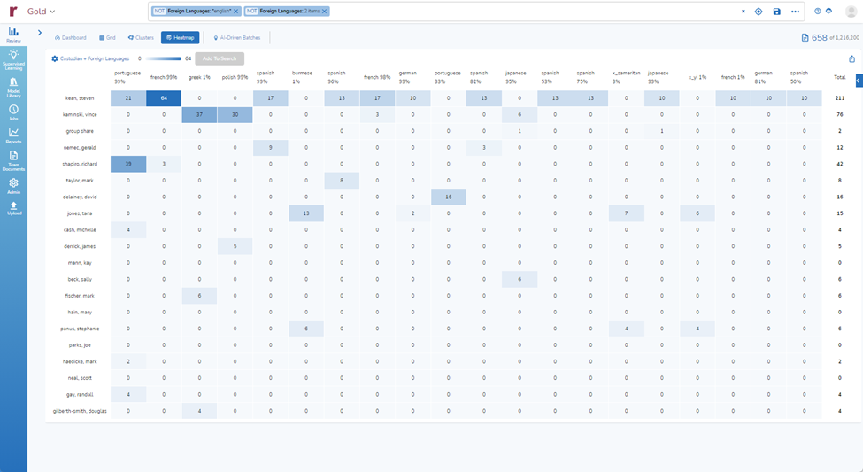
From there, I could increase the number of rows and columns to 20 each and add totals for a more extensive grid:
And There’s More
What I showed today is just touches on how we enable you to search using heatmaps, helping you enjoy the highest quality speed to insight in the industry.
For more information about how Reveal can empower your organization, contact us for a demo.