

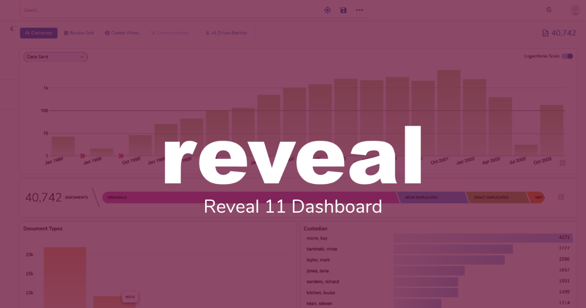
As I noted in my last post, Search in Reveal 11: Keyword, Concept, or Both, Reveal 11 offers search like you’ve never seen it before. For this post, here are some examples of how from the main Dashboard you can perform searches with just a few clicks.
Timeline
I’ll start with how to use the Timeline to perform date searches.
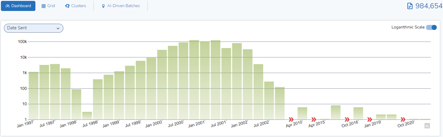
At the top of the Reveal 11 Dashboard is a display of a Timeline, an interactive chronological graph of the data you are looking at. (While the Dashboard is configurable, for this post I will use default settings.)
The timeline is displayed as a graph chart. The chart shows columns, one for each quarter (e.g., Jan – Mar) for which there is data. Each column depicts the number of documents sent in each quarter. The columns are mapped on a logarithmic scale, to better display a wide range of values in a compact way:
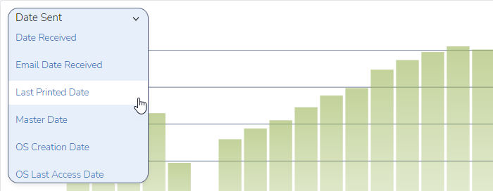
Change the Date Type
By default, the information displayed is based on “Date Sent”. Using a pulldown menu, I can change that to other option such as Applicated Created Dated, Application Last Saved Data, Appointment Begin Date, Appointment End Date, Date, Date Received, Email Date Received, Last Printed Data, Master Date, OS Creation Date, OS Last Access Data, and OS Saved Date.
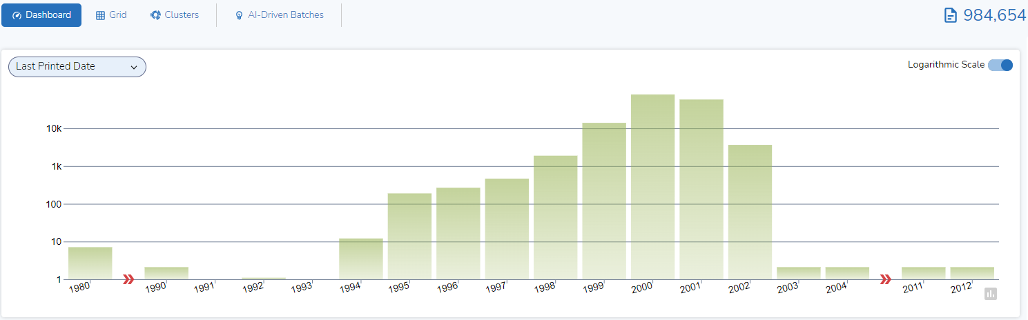
If I select “Last Printed Date”, you see a set of results that are very different from the ones shown above:
Zoom on a Shorter Period of Time
I can select a different period of time to be represented by each column, such as, depending on the dataset, year, month, week, day, hour, or minute. I can do this by clicking on a single column. Here, I selected the column for the first quarter in 1999 and clicked on it:
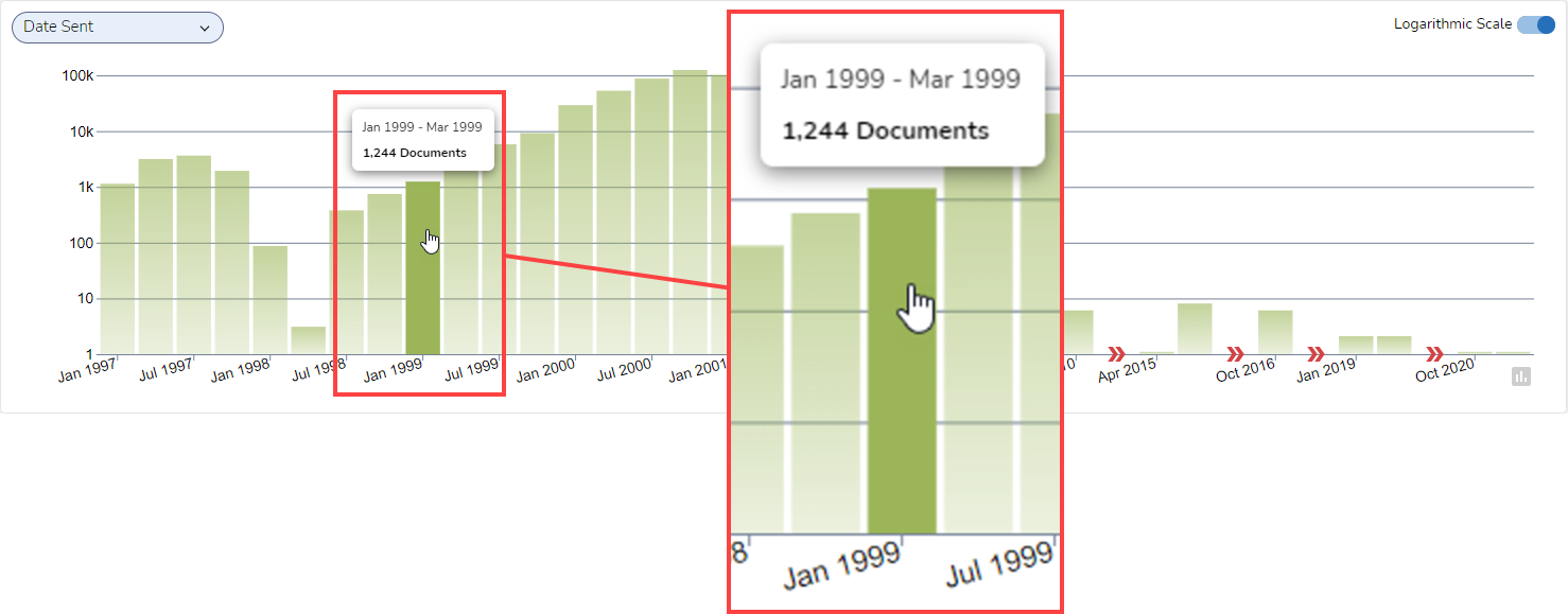
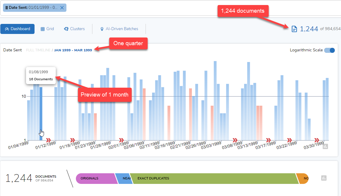
Below is the result. The time frame displayed is shorter, from January through March 1999 instead of from January 1997 through March 2021. The number of documents is smaller, 1,244 documents instead of 984,654. The scale of the display is different, with the tallest bar accounting for 63 documents instead of 124,691:
Modify Search Pill
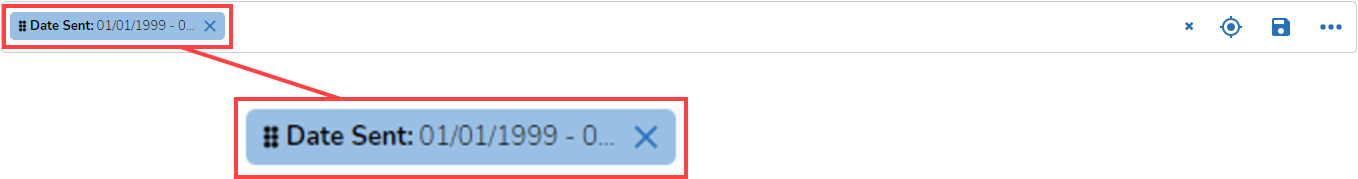
When I selected the column, the platform added a “Pill” to the search bar:
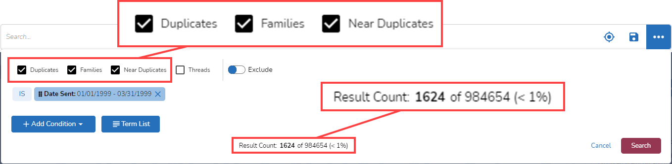
If I click on the Pill, the search bar expands and shows me more options:
-png.png)
I might click on the boxes “Duplicates”, “Families”, and “Near Duplicates” to have those documents included in my search. If I then click on “Preview result count”, I see that if I add these items, my results increase from 1,244 to 1,624:
Candy Bar
The default Dashboard displays a Candy Bar immediately below the Timeline. The Candy Bar graphically displays documents in the current view of the dataset in four groups: Originals, Near Duplicates, Exact Duplicates, and Not Analyzed. These groups are what they sound like. Documents in the last group, Not Analyzed, are there because the system could not analyze them; they might be encrypted, for example, lack text, or contain excessive text.
Hoovering over a portion of the Candy Bar will display the counts in that group:
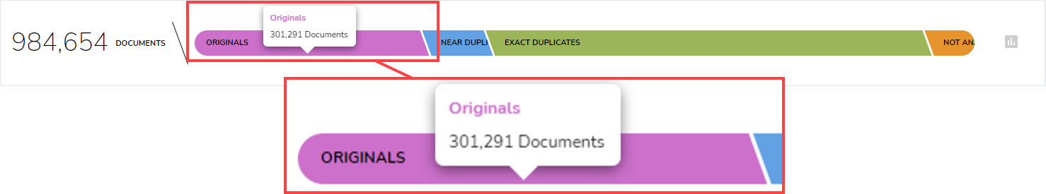
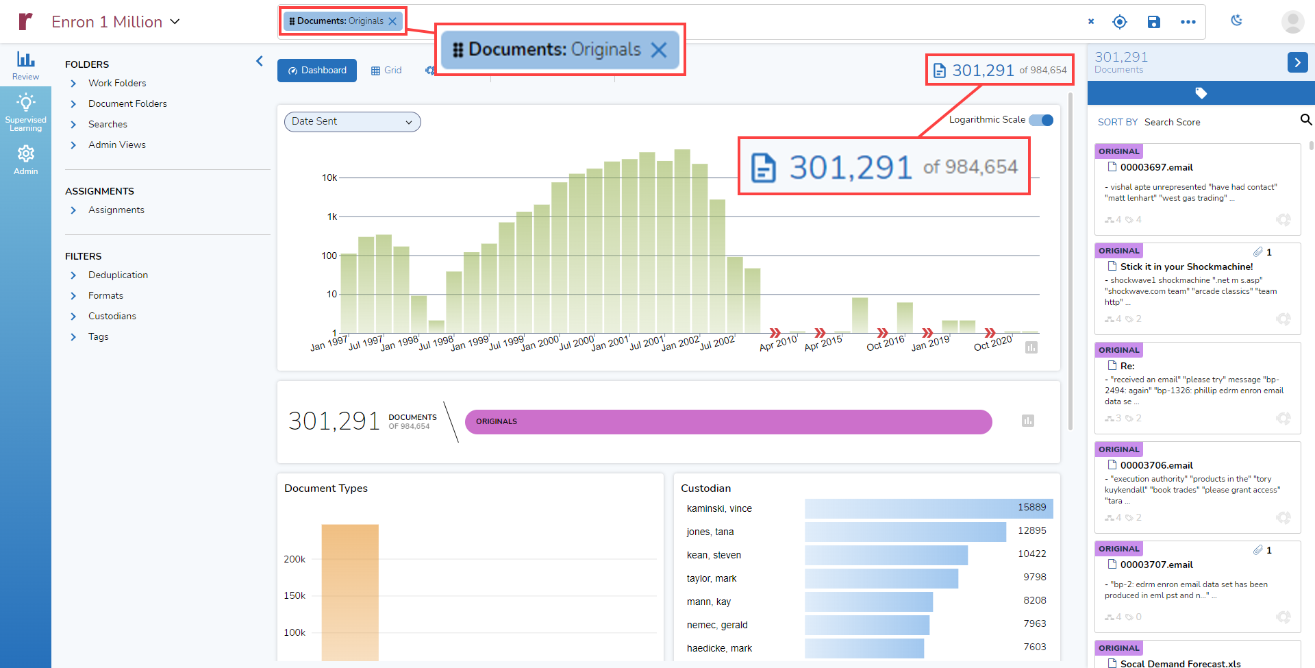
If I click on one of the groups, such as Originals, that search gets added as a Pill to the search bar and the Dashboard updates itself, displaying information about the 301,291 documents that meet the search criteria:
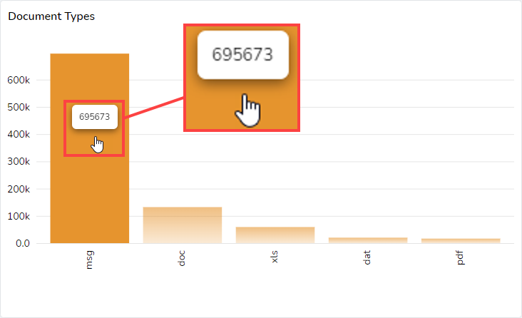
Document Types
Below the Candy Bar is a selectable graphic bar that shows the most common document formats found in the data displayed in the Dashboard. This example shows that in the Enron dataset I am using, with 984,654 documents, the most common document format is msg files, of which there are 695,673:
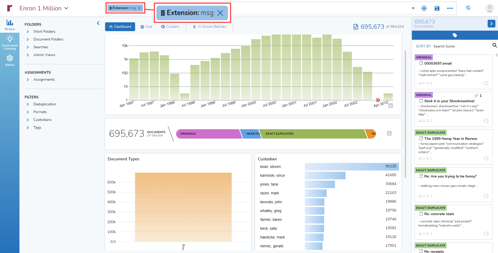
If I click on the msg column in the Document Types column, I get updated information in the Dashboard. You can see the Pill at the top showing that I am searching for all documents with the extension “msg”, and you see, as well, that the Timeline, Candy Bar, and other elements displayed in the Dashboard reflect the results of that search:
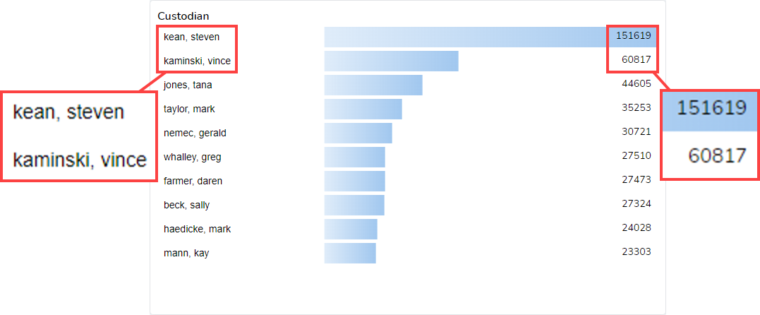
Custodian
To the right of the Document Types graph is another selectable chart, Custodians. This chart lists the top ten custodians in the current view along with the document of documents for each of those custodians. In the dataset I am using, I can see that the top two custodians are Steven Kean with 151,619 documents and Vince Kaminski with 60,817 documents:
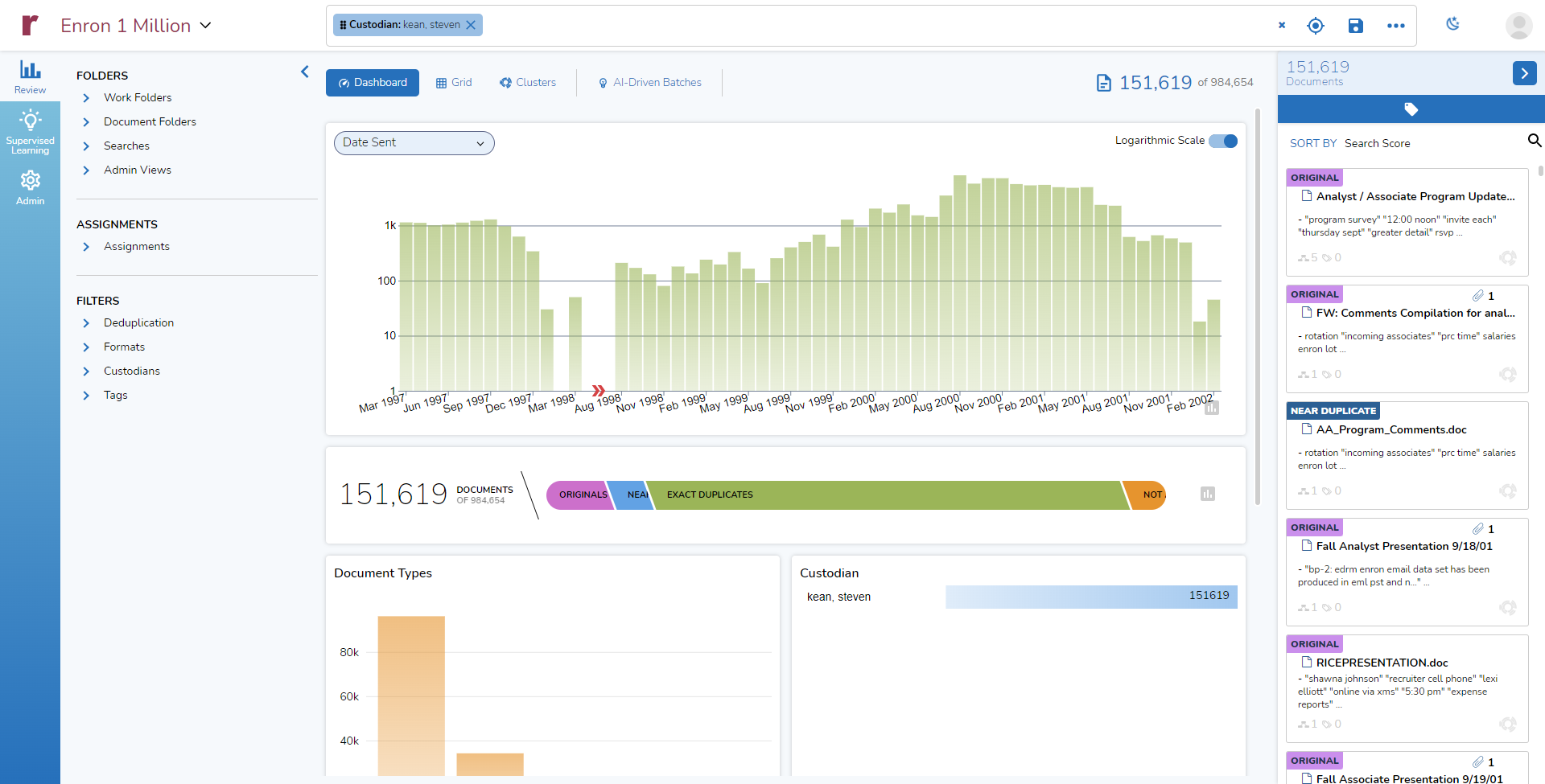
Again, I can click on the bar for “Steven Kean” and get an updated Dashboard:
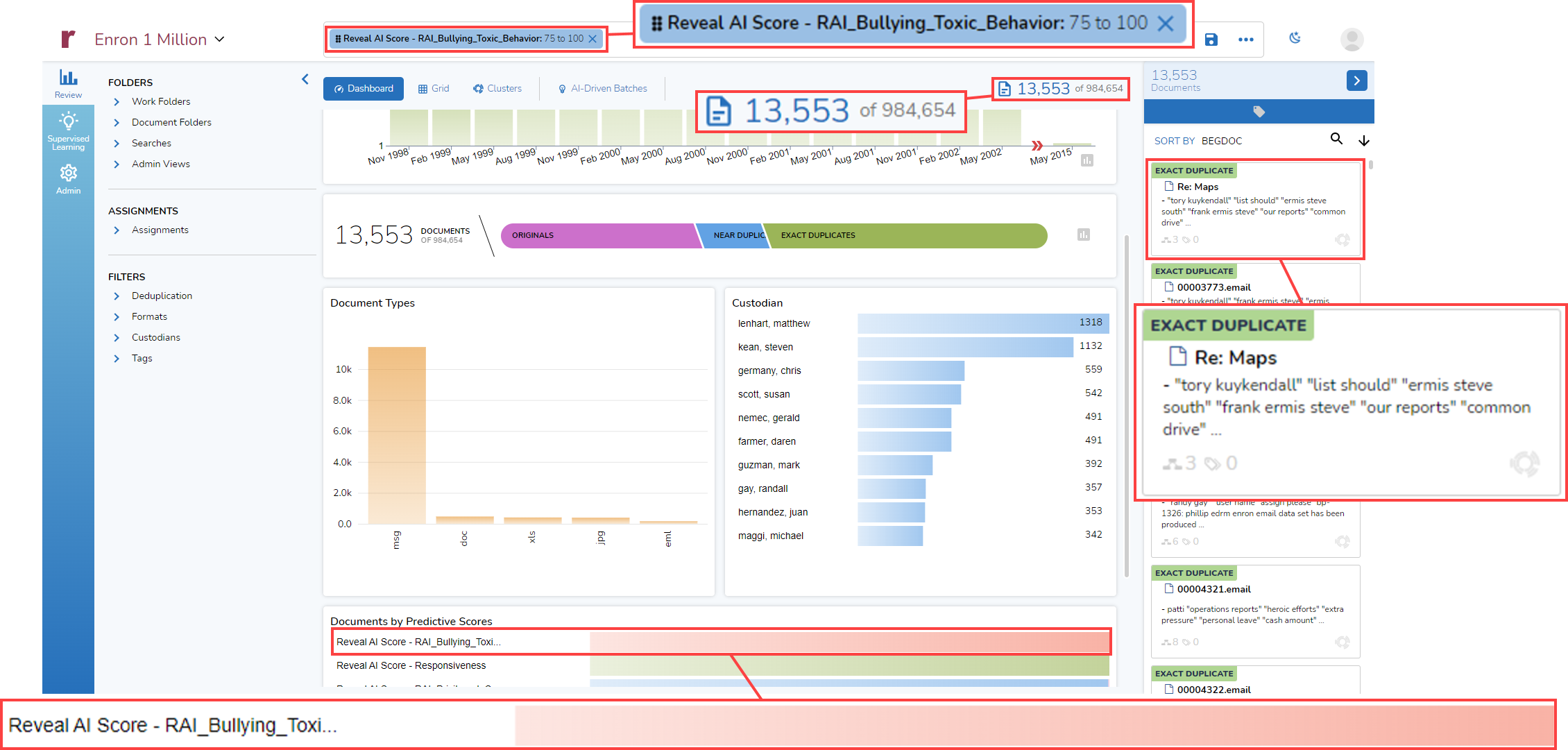
Documents by Predictive Scores
The last element of the Dashboard that I will discuss today is an interactive graph that shows documents by predictive scores. In this example, eight AI Models have been used with the data. Shown are the results of those model, as they apply to my entire dataset of 984,654 documents.
For each model, a bar shows the proportion of documents in each of four ranges of scores: 0 to 24, 25 to 49, 50 to 74, and 75 to 100:
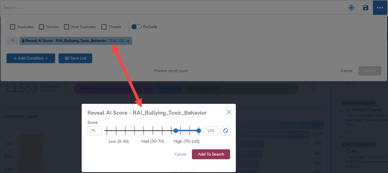
Finally (for today), I can click on the Reveal AI Score Pill and modify my search from there. I could add one or more conditions, include duplicates, or add a term list (to be discussed in an upcoming post). From within the expanded search bar, I also can click on the Pill again to select a different range of scores to use:
And There’s More
What I showed today are a few ways that with just a click or two Reveal 11 lets you search your data, helping you enjoy the highest quality speed to insight in the industry.
In posts to come, I’ll continue exploring the myriad ways you can use Reveal 11 and its greatly enhanced search capabilities.
If your organization is interested in learning more about Reveal 11 and finding out how Reveal uses AI as an integral part of its AI-powered end-to-end legal document review platform, please contact us.